It looks very clear and well organised :-) It would also be helpful if we could easily see whether the user was receiving other benefits at the same time.
Advisor 1
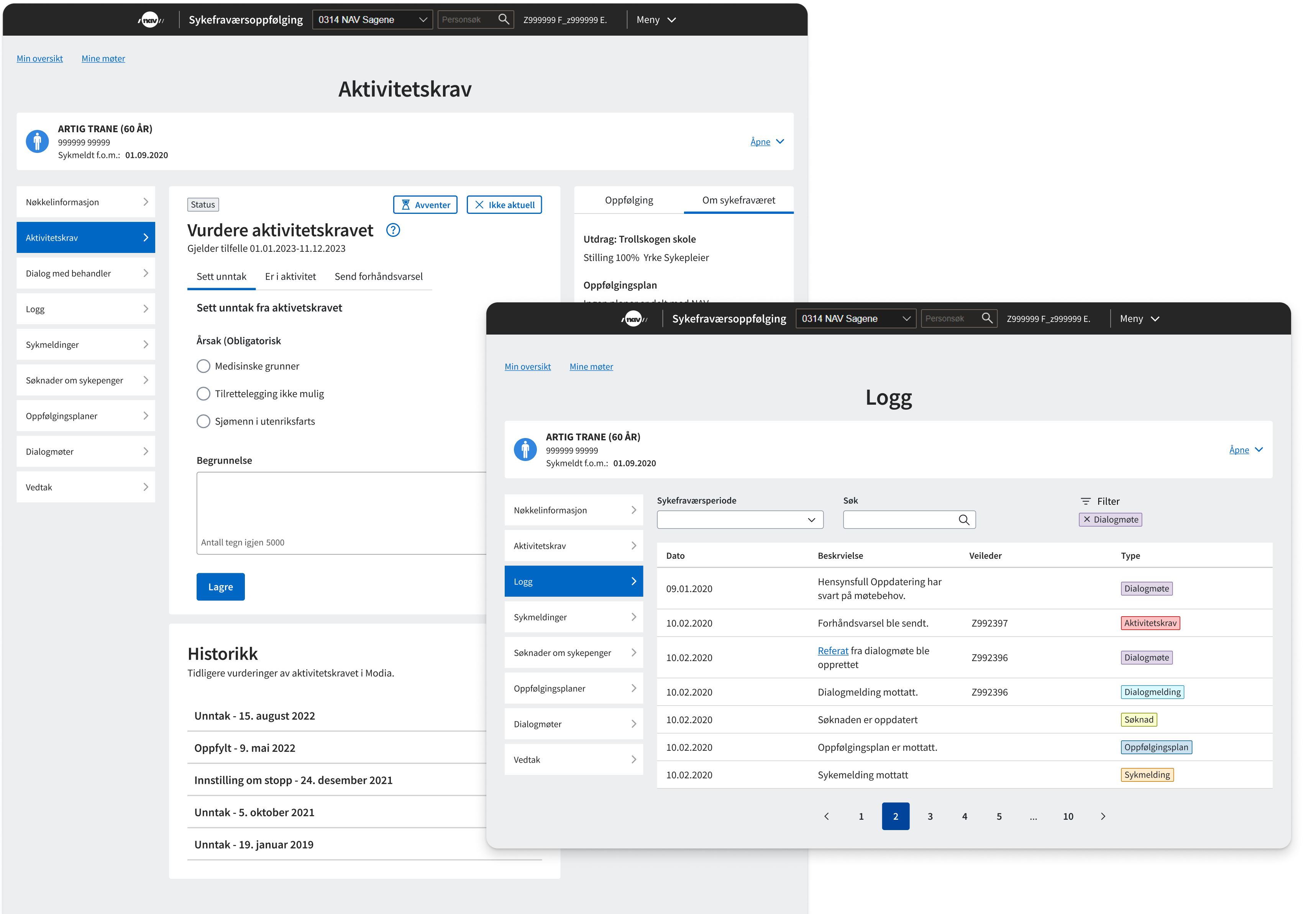
NAV was working toward more modern internal systems, and the team’s goal was to bring activity-requirement assessments into Modia. Around eight weeks into a sick-leave period, NAV has to assess whether the person is meeting the requirement to be in work-related activity or qualifies for an exemption. At the time, parts of the task still had to be completed in a legacy system.
I joined as the team’s product designer, working with developers, a domain expert, a lawyer and the product lead. I was responsible for research, interaction design and prototyping for the assessment flow and related improvements in Modia.
I facilitated interviews with advisors from three local NAV offices and invited other team members to join. Hearing advisors describe their routines and workarounds directly made the problems much more tangible for the team.
One thing that became clear was that local offices organised the work differently. That meant we couldn’t rely only on how the system was intended to be used, we also needed to understand the routines people had built around it.
Workaround Avventer was sometimes used as a reminder
Workaround Advance notices were sometimes used to request information
Some parts of the assessment still required advisors to move between systems. When writing a justification, the assessment itself opened in a separate modal, which meant advisors had to leave that view if they wanted to double-check information elsewhere in Modia.
The interviews also surfaced cases where existing features were being stretched beyond their intended purpose because there wasn’t a better place for the task. Avventer was sometimes used as a reminder mechanism rather than for its intended purpose.
Advance notices were also sometimes used to request information, even though they are formal warnings that sickness benefits may be stopped. That made them a poor fit for the task.
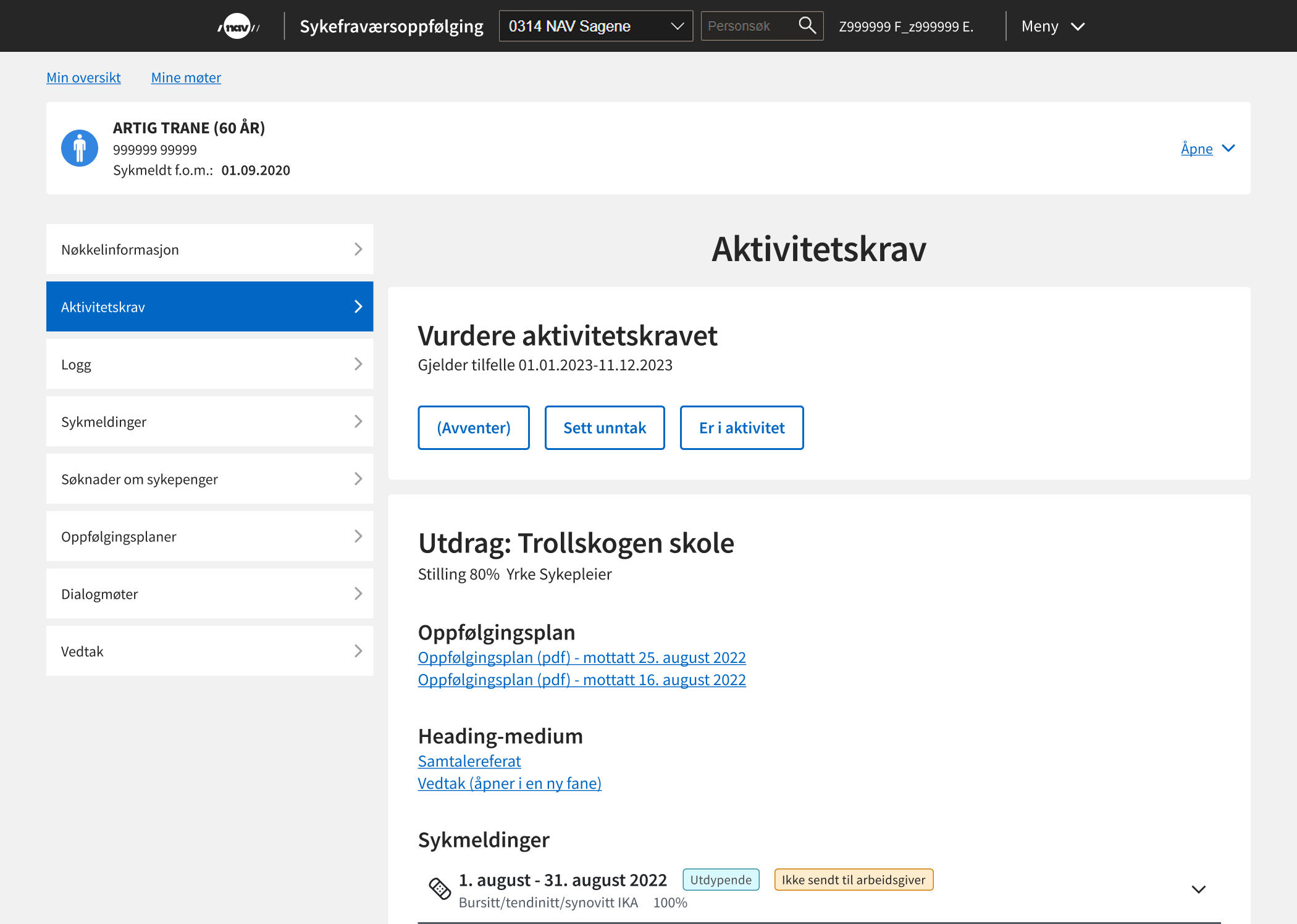
The work was shaped by three things: the functionality we needed to add, an opportunity to improve how supporting information was handled, and a need uncovered through research.
Adding the assessment functionality meant deciding how several new actions should fit into an existing interface. We considered three different approaches: a form-based flow suggested by a designer in a sister team, an expansion-card concept sketched by the product owner, and a button-based approach.
Each came with a trade-off:
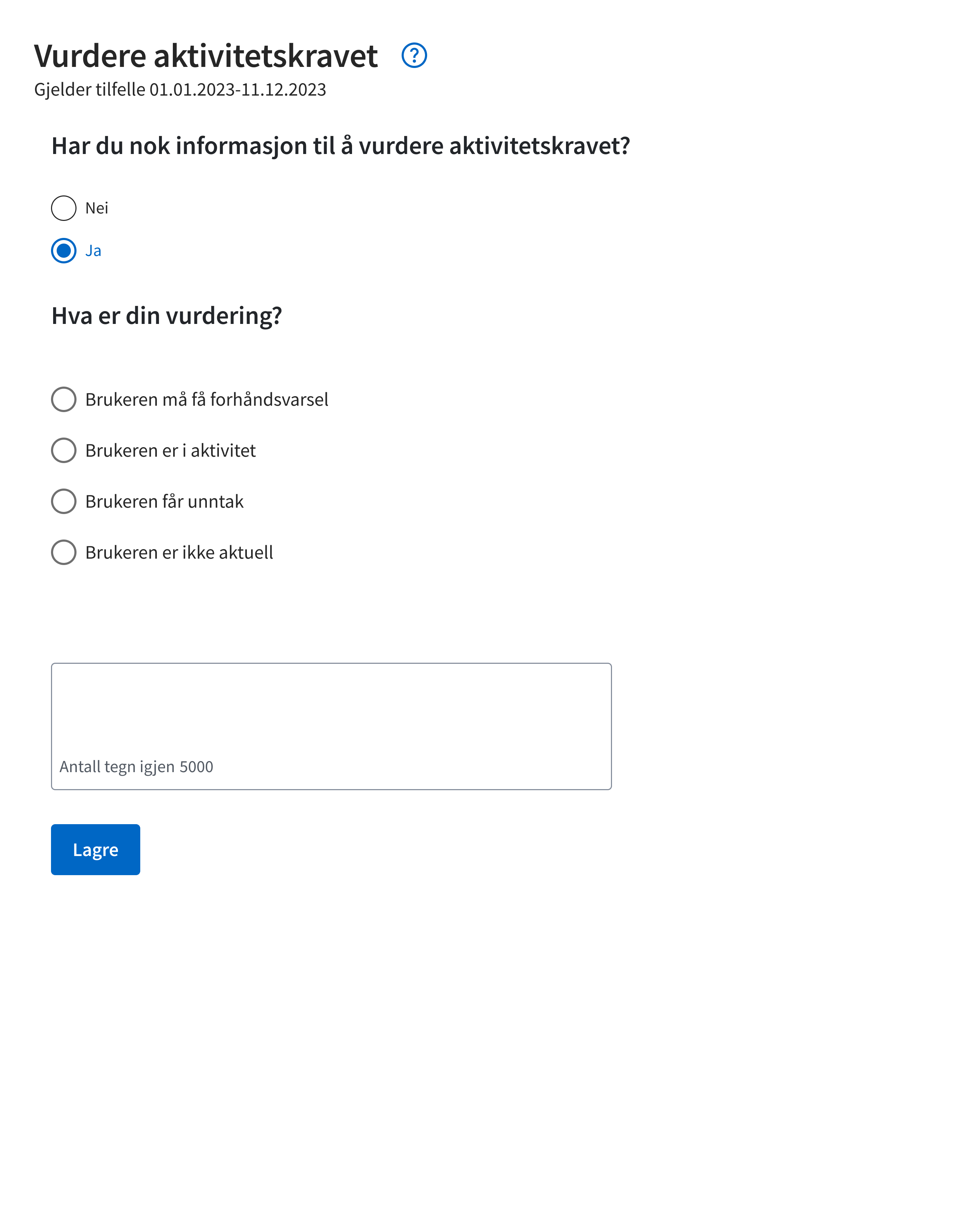
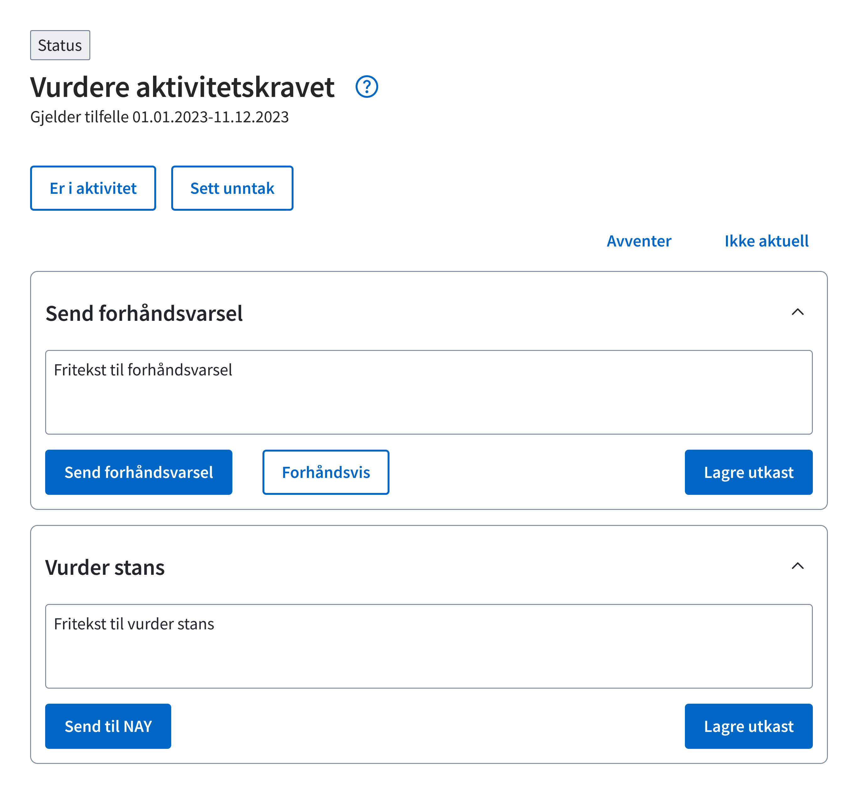
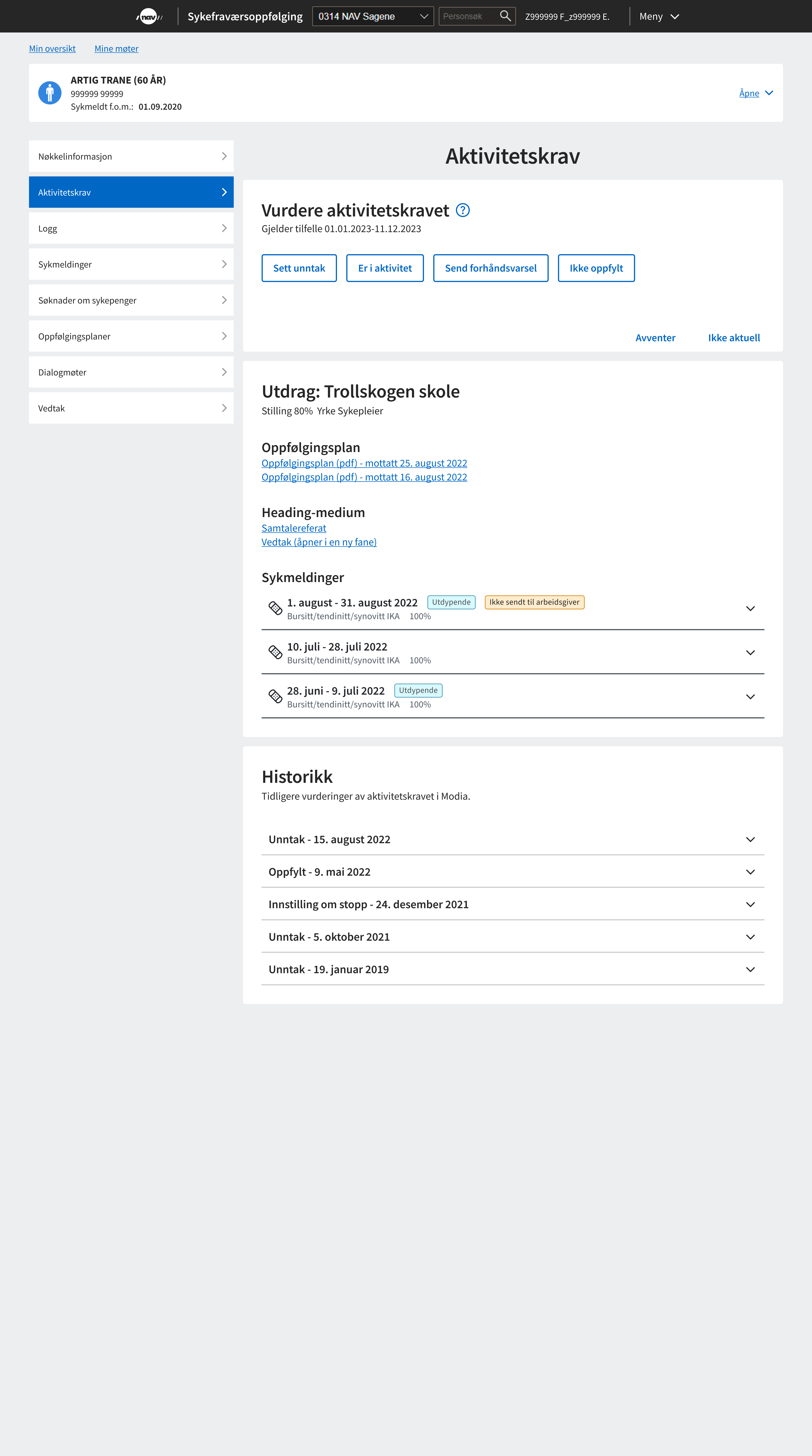
The product owner and I eventually settled on tabs. They gave the assessment actions a persistent place within the page, without turning a repeated task into a step-by-step flow or moving the work into separate modal views.
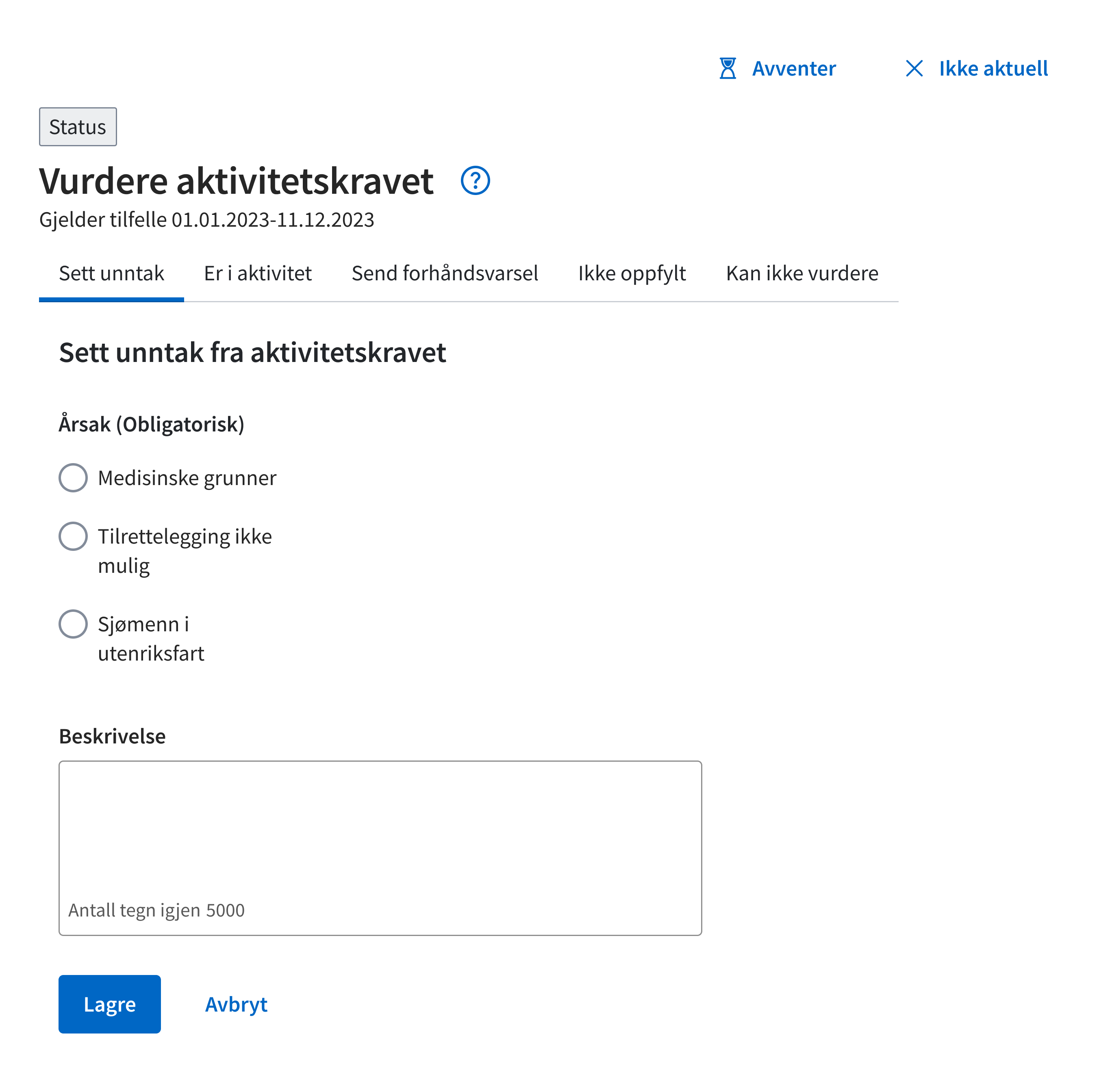
Writing a justification often meant referring back to information elsewhere in the case. In the existing setup, advisors had to leave the assessment view to double-check those details.
At the same time, the two-column layout left a very wide main content area. Screen-size data from Amplitude showed that many advisors were working on large monitors, which gave us room to explore a different structure.
I explored a three-column layout that kept the sick note visible alongside the assessment. It was intended as a starting point, with the possibility of adjusting which supporting information appeared there as we learned more. A secondary benefit was that it also gave the main content a more controlled width instead of stretching across the available space.
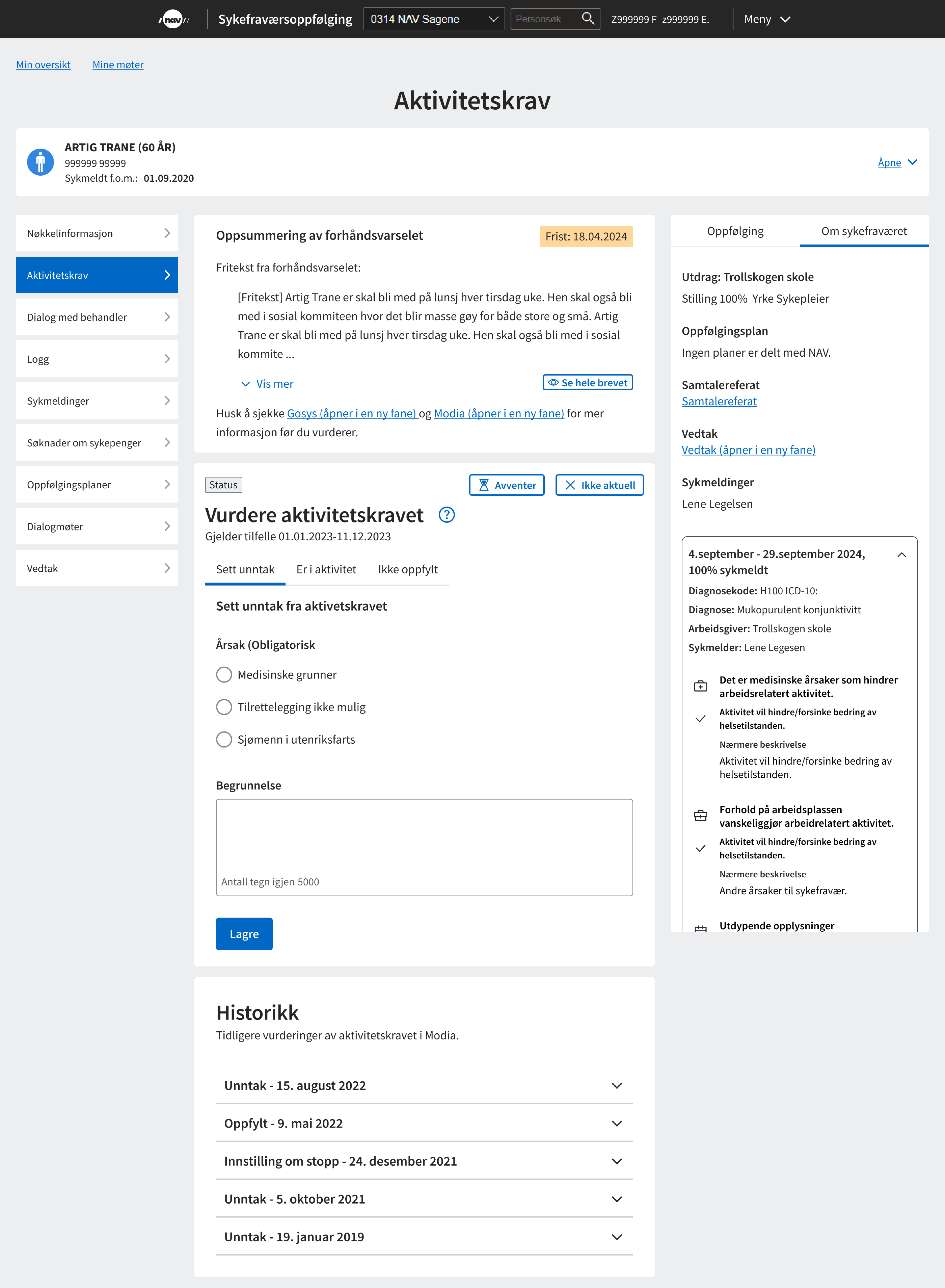
When the feature launched, I announced it on the intranet and followed the comments from advisors using it in practice. The feedback was mixed: some liked having supporting information visible while writing, while others preferred a vertical layout, especially on smaller screens.
It looks very clear and well organised :-) It would also be helpful if we could easily see whether the user was receiving other benefits at the same time.
Advisor 1
Personally, I thought it was better to have the information stacked vertically. The three-column layout isn’t an improvement — it was harder to read on a small screen.
Advisor 2
In response, we introduced a minimum width for the three-column version and adjusted how the sick-note information was displayed. That let us keep the layout where it worked well without forcing it into narrower screens.
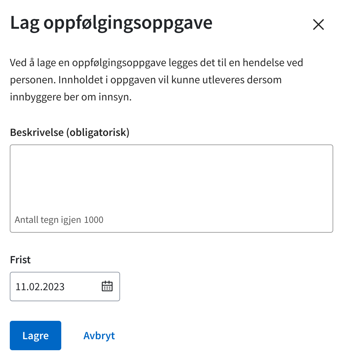
Interviews showed that advisors were sometimes using Avventer as a reminder mechanism because Modia had no dedicated place for personal follow-up notes. Advisors could be responsible for several hundred people at different stages of sick-leave follow-up, sometimes with weeks between each touchpoint, making it difficult to pick a case back up without some record of what needed to happen next.
This also mattered when cases changed hands, for example when colleagues had to cover for someone who was away.
I designed a follow-up task where advisors could write a note and set a due date. The intention was for it to eventually sit alongside the sick note in the third column, but because that layout had not yet been implemented, the first version was placed under the vertical menu as a persistent note.
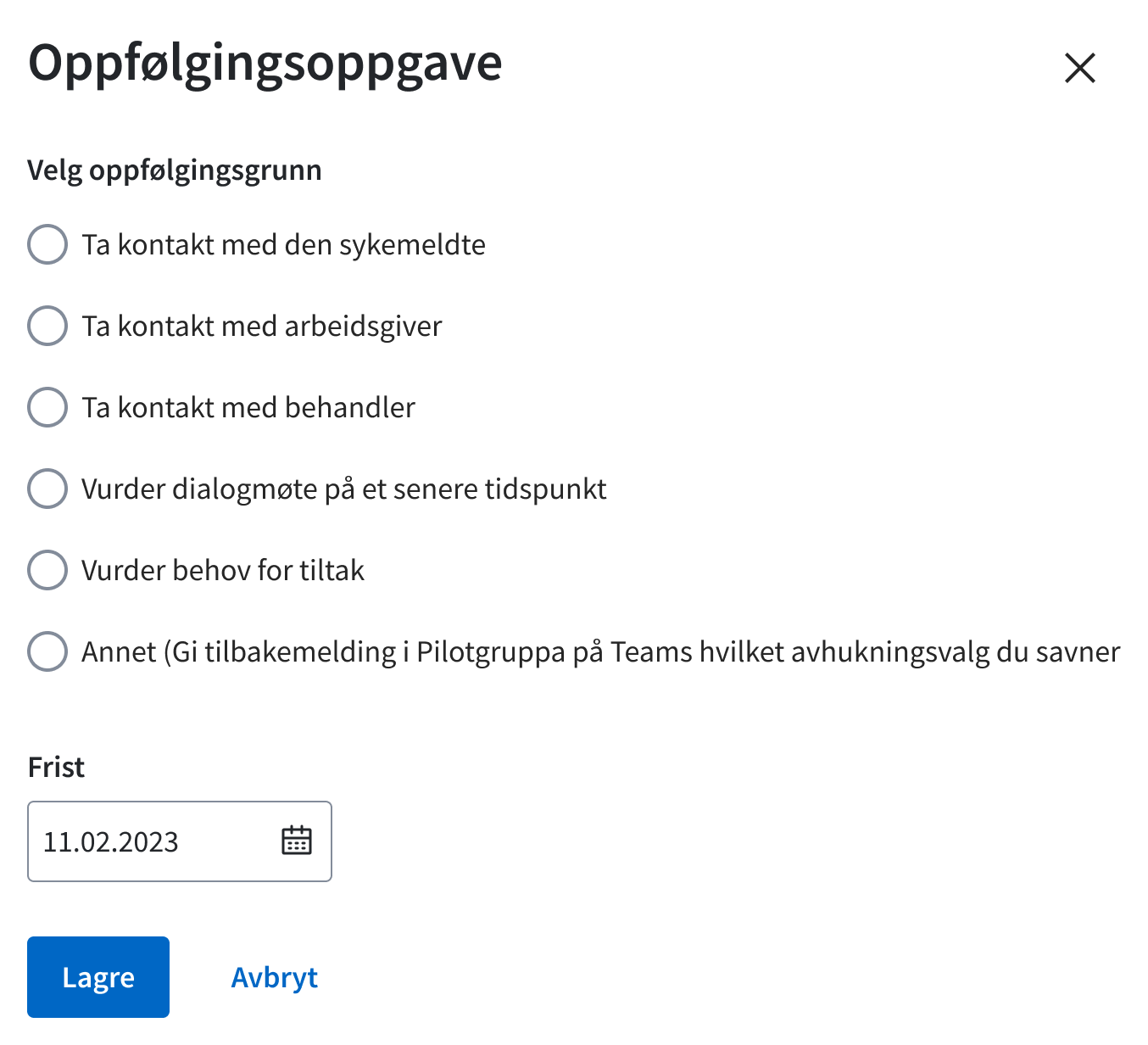
The free-text version was piloted at one office and was well received by advisors. After wider privacy concerns at NAV, the format had to be reconsidered. A revised version with predefined options was then piloted across three offices. The revised version reduced the flexibility advisors had liked in the original and no longer met the need as well.
When I left the team, the solution was still unresolved. The domain expert and legal resource were continuing with a risk and vulnerability assessment (ROS) before deciding how the feature should move forward.
The activity-requirement assessment was launched in Modia, including the new tab structure and three-column layout. Feedback after launch led us to introduce a minimum width for the three-column version and adjust how the sick-note information was displayed.
The follow-up task remained less resolved. Both versions had been piloted when I left, but the team was still working through the tension between the flexibility advisors needed and the privacy risks associated with free text.