Dialogue meetings
Reducing unnecessary navigation
Ditt sykefravær is made up of several user-facing pages within the same product domain, with different teams responsible for different parts of the experience. Over time, this had led to some variation in visual expression and use of the design system.
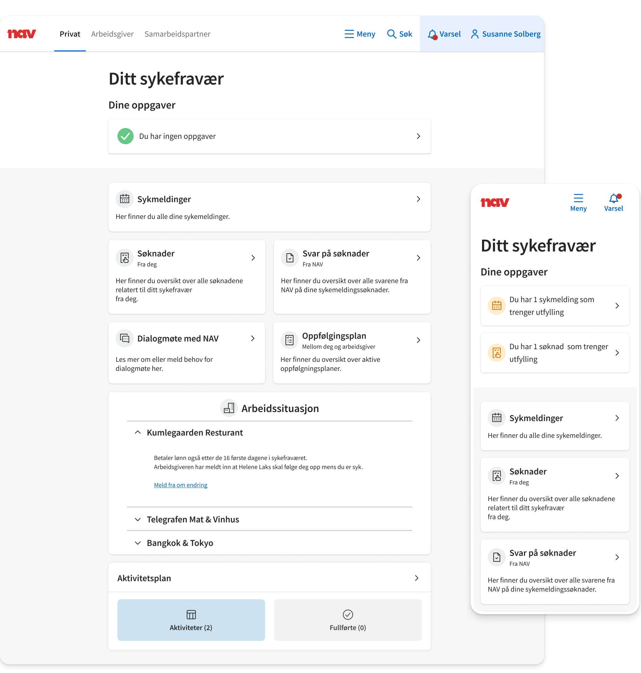
I was given an open brief to explore how these pages could feel more consistent and clearly belong to the same service.
The goal was not to redesign one isolated page, but to look across the parts of the sick-leave journey aimed at the person on sick leave.
Because the brief left room for interpretation, I first needed to decide what “more consistent” should mean in practice.
Rather than introducing a new direction, I chose to align the redesign with the recently updated Min side.
It gave me an existing reference for layout, hierarchy and component use, and helped anchor the work in a part of nav.no users would already encounter.
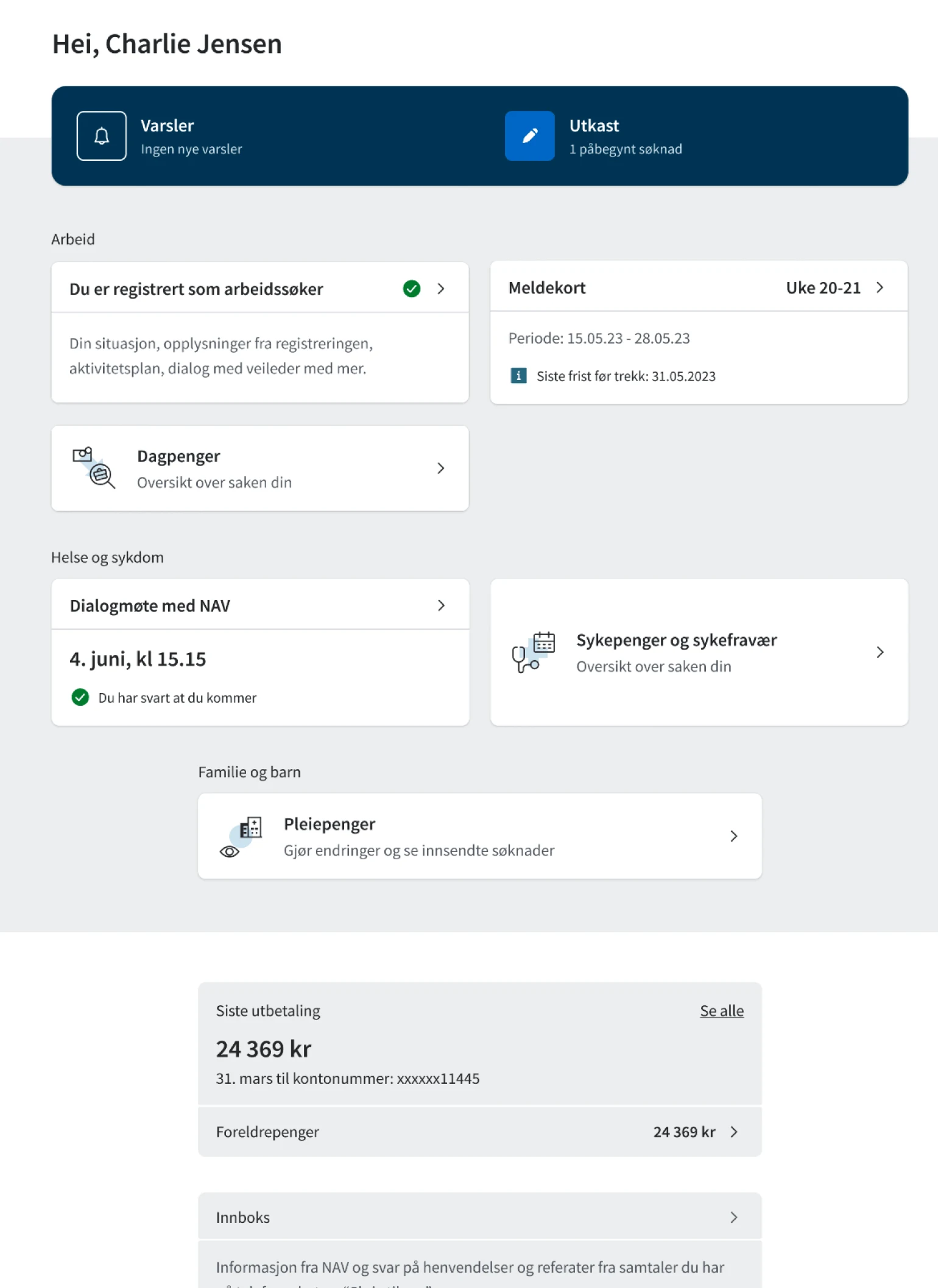
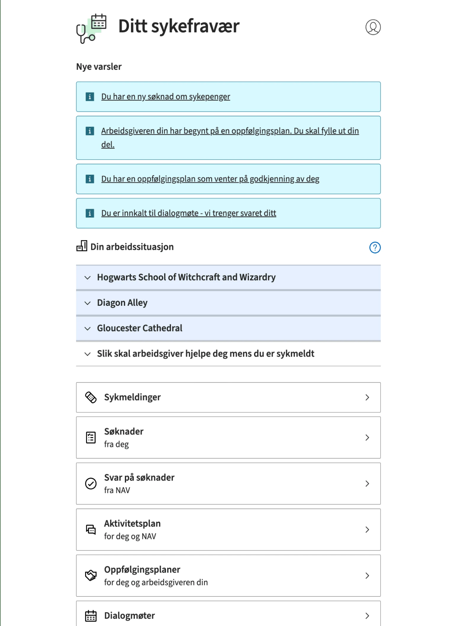
As I reviewed the pages, I found issues that couldn’t be addressed by updating the visual design alone. Some flows required unnecessary navigation, some information-heavy pages were difficult to scan at a glance, and in one case important deadline information was difficult to interpret.
I used a heuristic review to identify and document these issues, then explored improvements alongside the broader visual redesign.
Reducing unnecessary navigation
Exploring ways to make dense content easier to scan
Testing whether the existing guidance was actually understandable
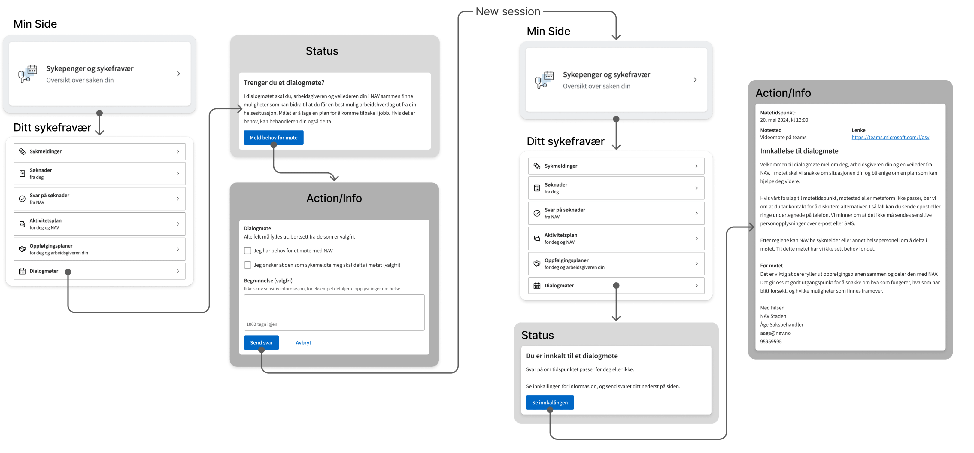
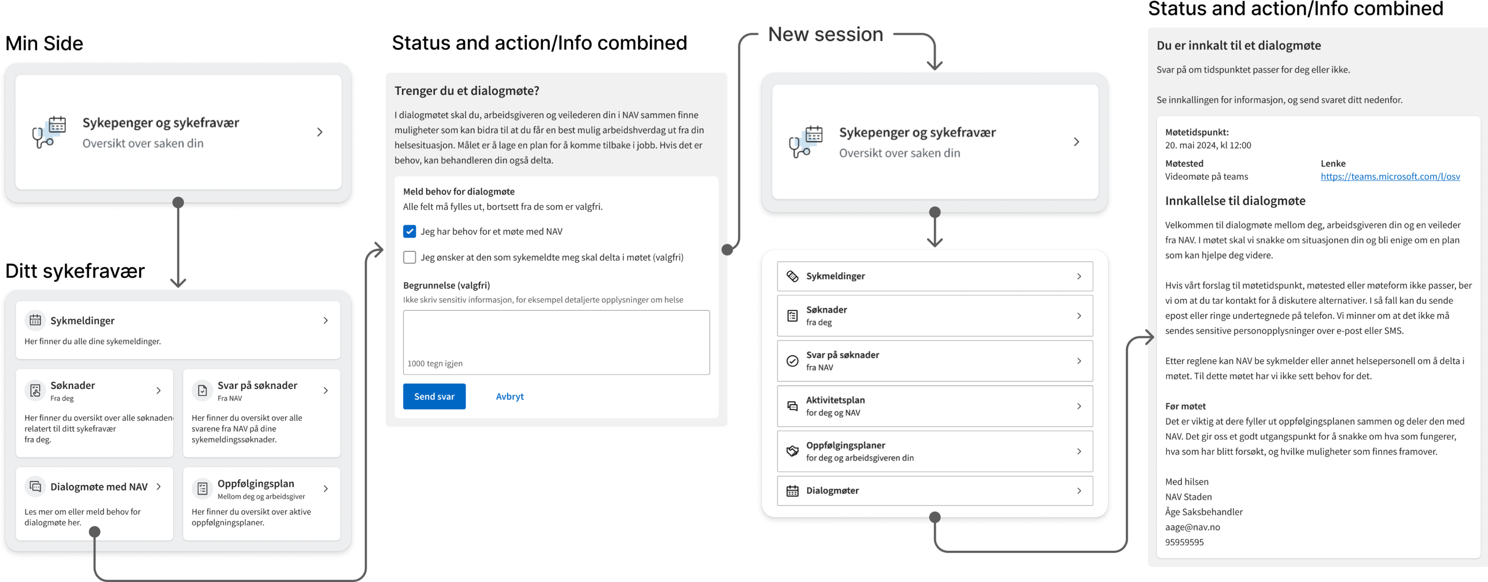
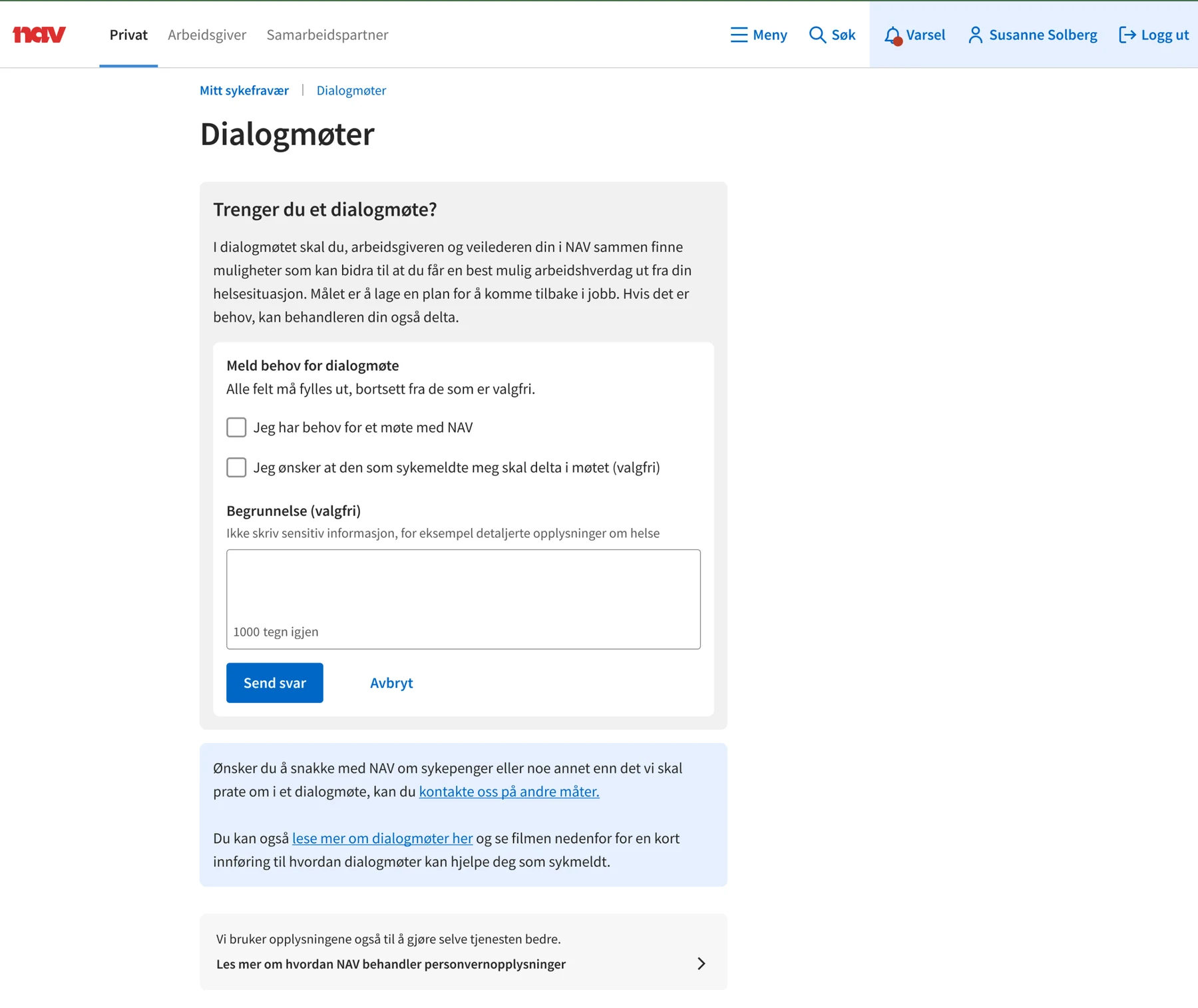
The existing dialogue meeting flow separated status information from the actions users could take. To request a meeting, users had to move through several pages before reaching the relevant action.
I explored whether the status, supporting information and available actions could be brought together on one page. In the proposed flow, the same task was reduced from seven interactions to five.
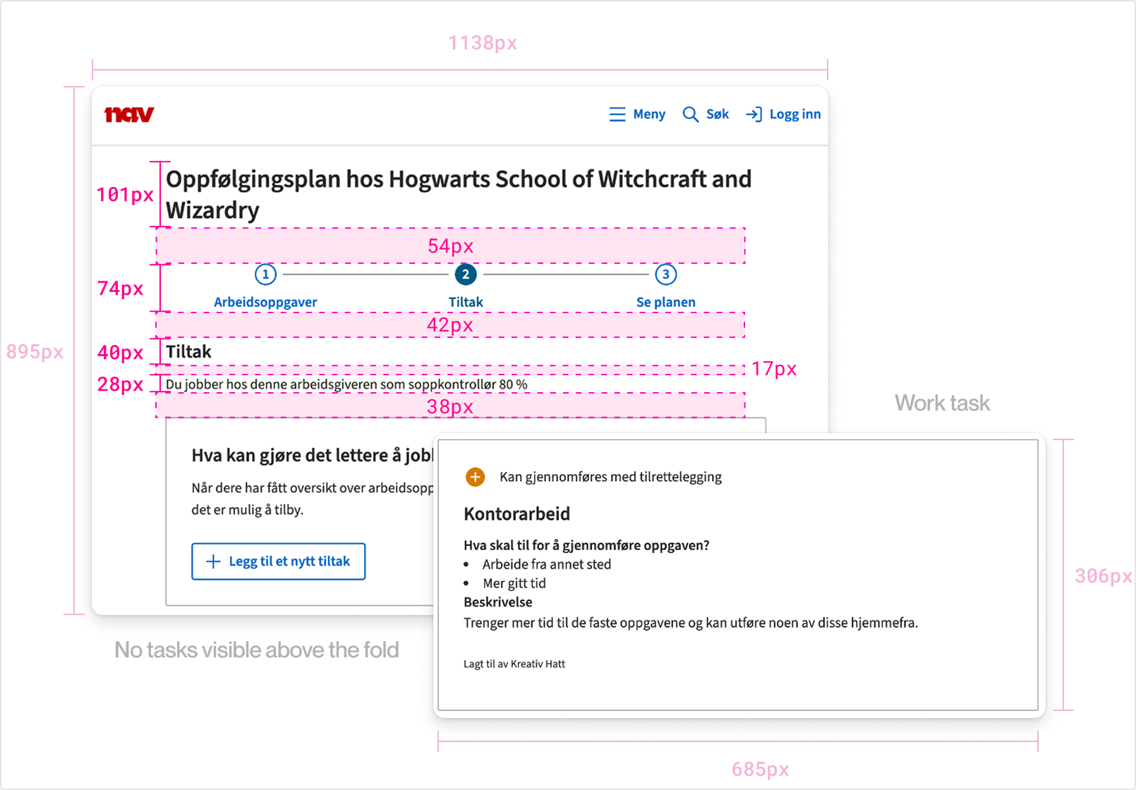
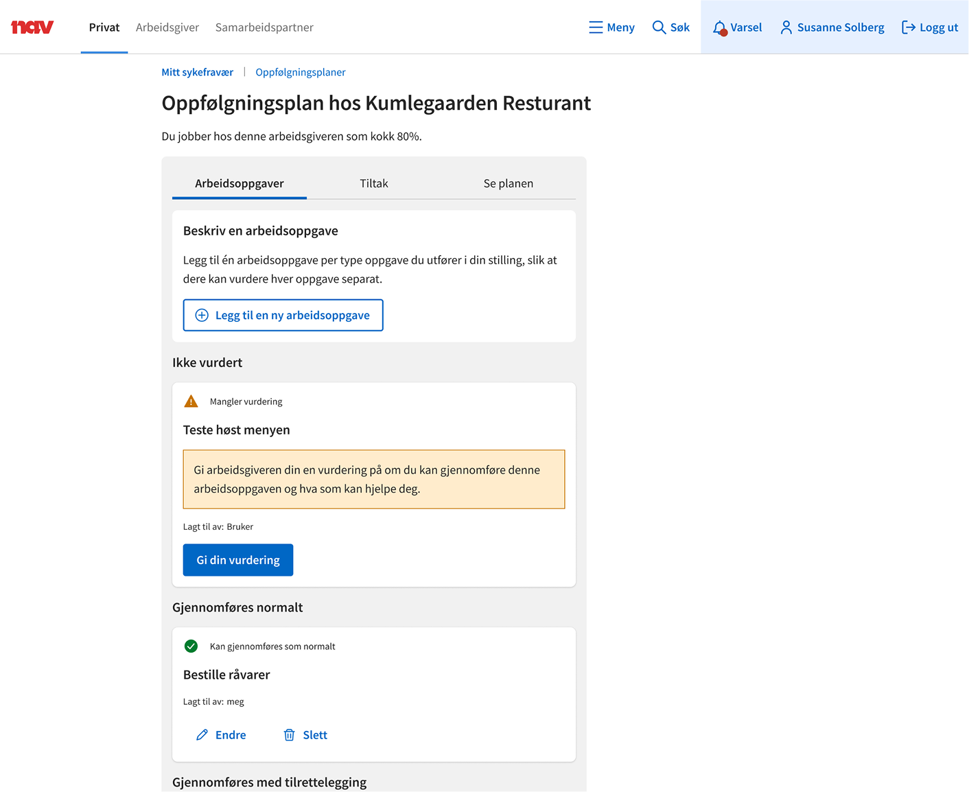
The existing activity plan used large cards that took up a lot of vertical space, making it difficult to get an overview of several activities at once.
I explored different ways of organizing the same information, including single-column, fixed-width, variable-width and kanban-style layouts. The goal was to see how much the content could be condensed without making it harder to read.
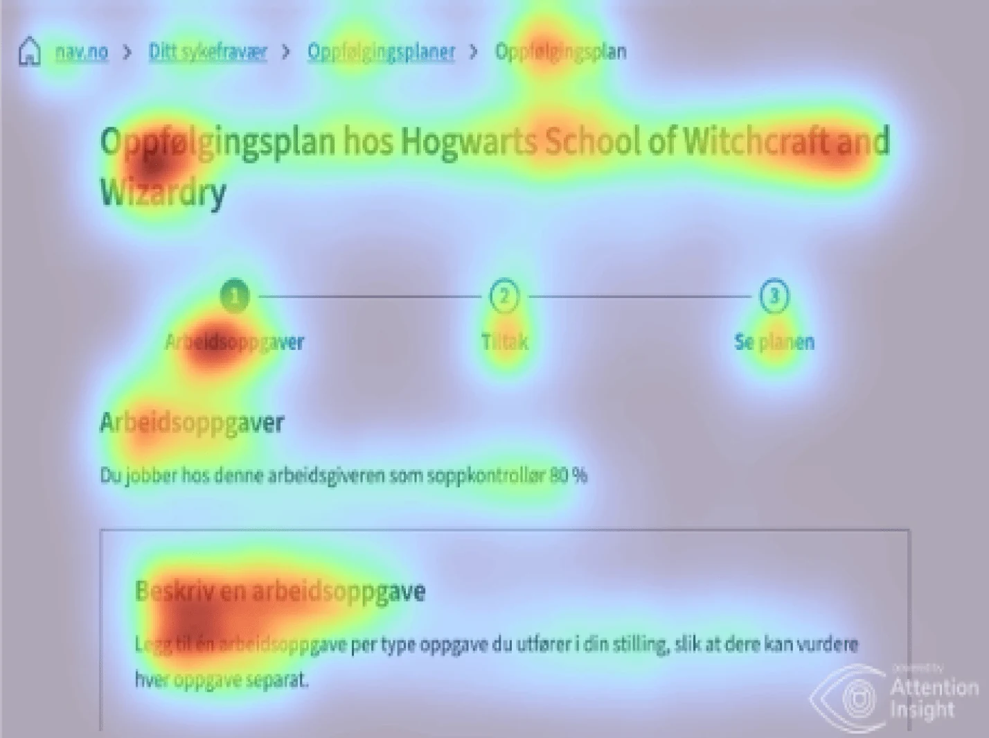
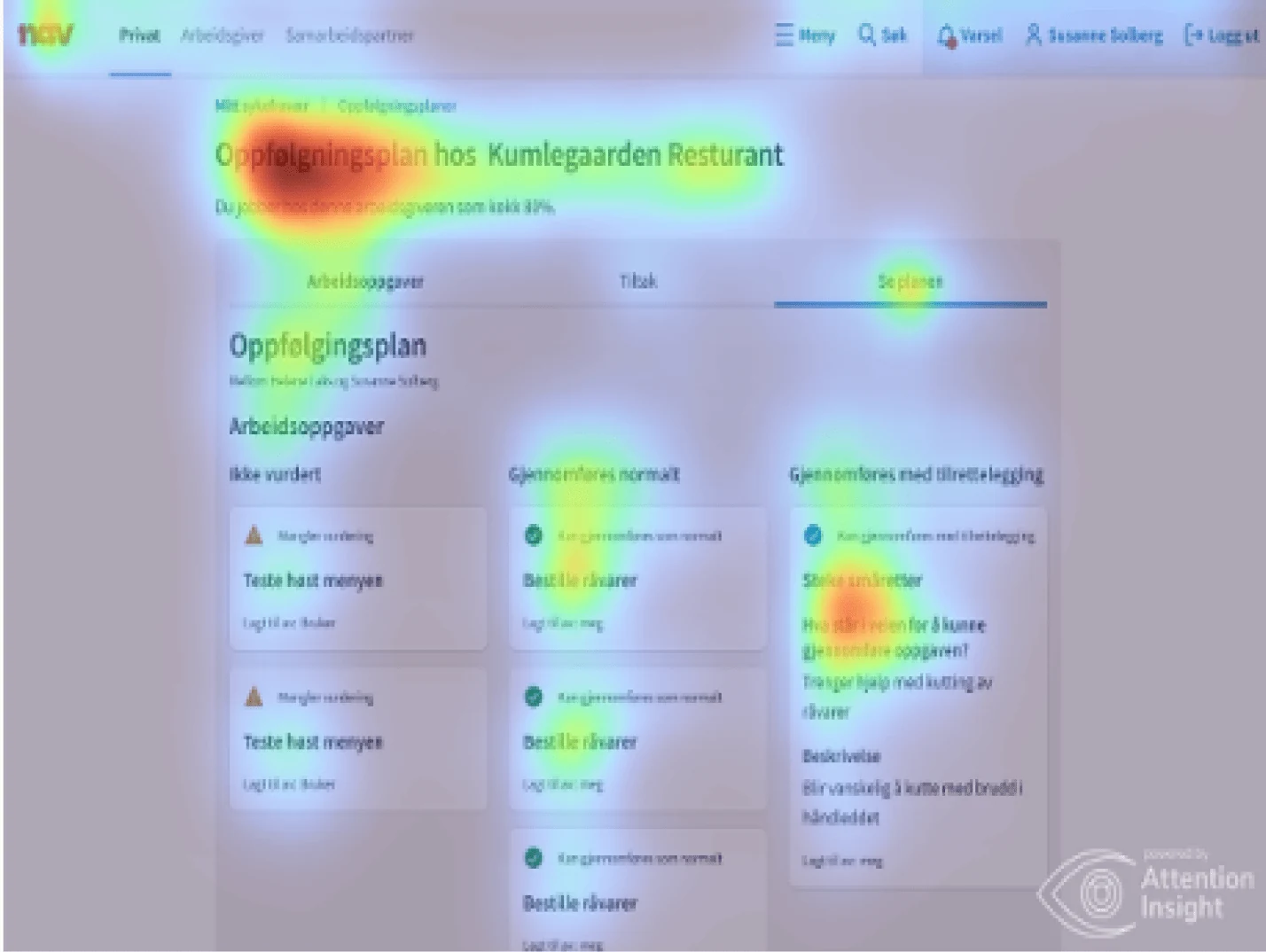
Predictive attention heatmaps were one comparison input, not validation.
I also used a predictive attention heatmap as one input when comparing the layouts, but the work remained exploratory and did not end in a single selected solution.
The application deadline for sickness benefits depends on whether the sick-leave period crosses into a new month. The existing page explained this through text examples, which meant users had to work out how the rule applied to their own dates.
I tested the guidance with seven participants using two deadline tasks. On the first task, half answered correctly, with an average completion time of 1 minute 33 seconds. On the second, 75% answered correctly, with an average completion time of 2 minutes 9 seconds.
Based on this, I proposed showing an estimated deadline directly in the interface, using the same underlying logic as the existing examples. The estimate would still need to account for exceptions, but it could give users a clearer starting point than asking them to calculate the date themselves.
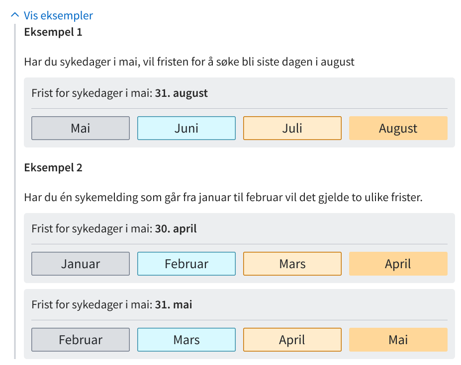
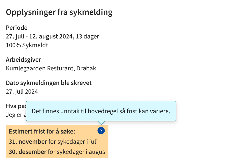
The redesign remained a set of design proposals rather than a fully implemented solution. The work was carried out as a smaller initiative alongside other priorities, with different teams responsible for different parts of the domain and limited opportunity for broader validation.
Even so, the work proposed a clearer visual direction for the user-facing sick-leave pages and surfaced several usability issues that could be explored further.